Minerva
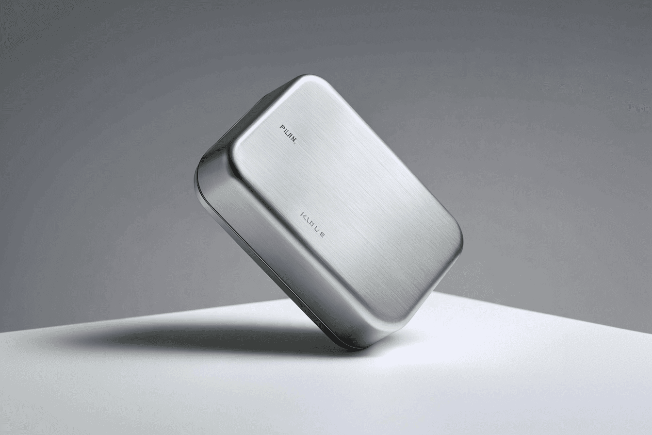
Minerva’s branding combines minimalist geometry with sleek typography, while the digital presence highlights functionality and design craftsmanship. The brand speaks to forward-thinking audiences.
2020
Branding, Digital
Close
Sample copy: A considered identity built around simple geometry, precise typography and a quiet confidence. The visual language gives Minerva a recognisable presence across packaging and digital touchpoints.
Sample copy: The digital experience carries the same attention to detail as the physical product. Clear layouts and carefully paced imagery put materials, form and craftsmanship at the centre of the story.
32%
Sample metric: increase in enquiries
12 weeks
Sample metric: project delivery time
6
Sample metric: brand touchpoints